Now that we are almost half way through this year, it’s the perfect time to look at established logo trends for 2018.
Logos have to stand the test of time as they convey the ethos of a business or a brand to the consumers.
That is why a good logo design demands that it is timeless, simple, memorable, versatile and appropriate for that business.
Working within that framework logo designers have the task of designing unique logos for businesses and as they work through the design process various trends begin to emerge.
Some trends are innovative and make a logo design stand out while other trends may land up making a design look shabby or outdated the next year when the trend dies out.
It’s a bit tricky when it comes to following trends and that’s why good logo designers are not sticklers for trends but are supporters of innovative designs.
So let’s take a look at what four talented logo designers have to say about logo designing and logo design trends for this year.
DESIGNER: Maria Grønlund
www.behance.net/MariaGroenlund
Maria is a graphic designer and digital artist from Denmark and she mainly works with branding and digital art.
With a background as a classical singer and pianist, Maria only started designing when she was in her early thirties.
She was hired as an apprentice at an agency whose clients often wanted their printed material to look great and would offer their often badly designed logos to put on all their flyers and folders.
And so the agency started offering unsolicited logo redesign and that’s when Maria got her first big break.
She was asked to redesign the logo for Fobazo – the official website for the greatest football players in the world.
Maria’s client base includes Adobe, Coca-Cola, Getty Images, CNET founder and IT-legend Halsey Minor.
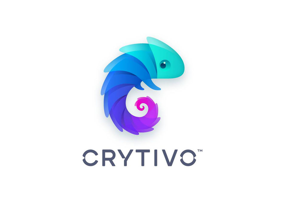
Important aspects of logo design
“You should, to a certain degree, be able to identify what kind of company the logo is for when you look at the logo”, says Maria.
The visual representation of a logo tells the story of the business and hints at the business’s industry and their values.
“The logo helps create a sense of belonging,” adds Maria.
Distinct logo trends for 2018
“There’s been a tendency to keep logotypes very clean and simple for a while. It’s refreshing to see a more playful and diverse use of typography for logotypes, the letters arranged in a non-linear way such as using bolder and daring font choices,” adds Maria.
Another trend Maria is inspired by is the use of bold, saturated colours which are much more difficult to handle and balance than subdued neutral tones.
She notes that sparkling violets and unique colours out of the CMYK spectrum are finding their way into logo design.
“Violet is one of the hottest colours in logo design. It’s remarkable to see how the symbolism of the colour has gone from being a mysterious hue to a colour that is considered very funky and fashionable.”
Maria’s personal designing style
“I have a playful and curious approach to just about all the designs I make” Maria remarks.
Maria’s design often starts as experiments and are refined through many iterations.
Projects with creative freedom are her favourite kind.
Favourite Logo design
Gia Bokhua’s logos - especially his dove logo.
DESIGNER: Jared K. Nickerson
Originally from Halifax, Nova Scotia in Canada, Jared is now based in San Diego, California.
Jared is passionate about graphic design and over the years he has cultivated that passion, built an impressive client base and established his own studio – J Three Concepts – 15 years back.
He has done branding work for Nickelodeon, Adidas NEO, Ubisoft, and Billboard Hot 100 to name a few as well as over 100 bands and clothing labels.
He now does a lot of product design work and mainly works for companies such as Sony PlayStation, Blizzard Entertainment, Brooks Running and Mizuno to name a few.
But branding and logo design work always end up on his desk and it’s something that is close to his heart.
Jared’s clients include Nike, Adidas, Coca-Cola, Blizzard Entertainment, Valve, Microsoft, Nickelodeon and Nintendo.
Important aspects of logo design
“Legibility is the big one. As basic as that sounds, it's always important. I remember someone telling me that a good logo is one that someone can draw from memory on a bar napkin in a few seconds,” explains Jared.
Certain fonts and wordmark logos can be hard to read and glyphs that don’t make much sense can quickly kill a brand.
“As a general rule, it's something good to remember, especially when working on corporate logos and core branding,” adds Jared.
Distinct logo trends for 2018
“I typically don't follow logo and branding trends that often. My clientele normally come to me for very specific styles, so I don't stray from that too much,” says Jared.
However, Jared does see a rise in logos that are incorporating basic geometric shapes and masking patterns.
Simplicity is another trend Jared believes is important. Many corporate rebrands are incorporating simplicity over the last few years.
Jared’s personal designing style
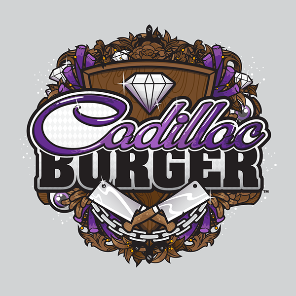
“I like a chunky, thick logo - something with a nice heavy presence. This naturally only works for certain brands, but if done right can have a nice impact,” says Jared.
An example of this would be the Billboard Hot 100 logo designed a few years back by Jared.
Jared also enjoys working on wordmarks. “I like going through and picking a good base type or something I've hand drawn, then establish a level of detailing, fleshing it out and then trying it with various executions and usages,” Jared explains.
He finds it gratifying to go through and keep track of how the design evolves with each iteration.
Jared also enjoys the initial exploration of a logo, especially one for an established client.
“Some of my favourite ones have been various logos for Nickelodeon projects, and a lot of the smaller clothing labels as well.”
However, his least favourite logos are band logos!
Favourite Logo design
Adidas and how various elements are worked into the core logo. Nike and footwear branding are one of his favourites.
DESIGNER: Caroline Mitic
Caroline is a graphic designer from Victoria, British Columbia in Canada and has been designing for over 12 years.
She was an in-house designer while she also freelanced. But three years ago she decided to quit her job and go full-time into freelancing.
According to her, it’s the best decision she has ever made!
She loves working with small to medium-sized local businesses and loves to make design decisions at the grassroots level rather than follow an existing brand.
Her favourite kind of client is one that is environmentally conscious and is creating something to improve the lives of people.
Her clients include The University of Victoria, Royal Roads University, Lekker Foods, Merry Maids Victoria, Buckerfields and The Victoria.
Important aspects of logo design
“A logo needs to appeal to its audience. It can’t simply just meet the desires of the person hiring me to design it. One of the most important things I do is research my client’s target demographic to understand what type of design will sell to them,’ says Caroline.
Caroline believes that it important to educate clients on what kind of design will be effective for their brand as sometimes clients are fixated on particular designs which may not be right for their brand at all.
Distinct logo trends for 2018
“I try really hard to stay away from anything too trendy. We’re already seeing the “hipster logo” go stale, and I like to create things that have at least a ten-year shelf-life,” adds Caroline.
Caroline believes that a simple design with a lot of white space is a timeless trend.
And the one trend she likes to stay away from is hand-written fonts, especially those that are downloaded for free!
Caroline’s personal designing style
Caroline sums it up “I seem to specialize in clean, simple, modern design. This goes for both logo and layout design. My style has certainly evolved over the last few years to be quite corporate, but that seems to be what I’m best at.”
Favourite Logo design
DESIGNER: Ian Paget
Also known online as Logo Geek, Ian is a graphic designer from Manchester, UK.
He provides logo design services and has established a significant community of logo designers.
Logo Geek started off as a fun side venture and is now a full-time logo design service.
In 2016, Ian decided to focus on Logo Geek and left a comfortable Design Director position at a web design agency.
Ian always wanted to be a graphic designer but due to personal circumstances, he could not go to university and instead started off on a temporary warehouse job where he could work on posters, leaflets and booklets.
From then on, Ian started working on bigger projects, always learning on the way and his passion for design led him to start his own studio.
Ian’s client base includes Rocks & Road, NowKeto, Caterbox, Orema and Elucido Psychology.
Important aspects of logo design
Ian sums it up in one word. Simplicity.
“If you look back through old logo design gallery books, the logos that are timeless, that could have worked 50 years ago and would still work today, are the designs that are most simple,” adds Ian.
A simple logo is versatile. It is recognisable at the size of a postage stamp as well as a billboard.
Ian says that it’s important to identify the core idea that makes the logo distinct and then focus on minimising and reducing the design down to the most basic of components while keeping that distinct idea intact.
Distinct logo trends for 2018
“The most notable trend over the past few months is that logo designs are becoming consistently simplified — to use very minimal shapes and forms,” says Ian.
Ian feels that the demands of social media, which is primarily the most important method of communication these days, is driving the need for simplification in logos as they need to be recognisable in incredibly small sizes.
The use of san serif fonts is another trend that Ian finds is making a distinct presence this year.
“Logo redesigns are very frequently making use of sans-serif typefaces, often causing the logo to have less unique characteristics when compared with the previous logo.”
Ian’s personal designing style
“I’ve been focusing on logo design now for around 5 years, and throughout that time I’ve been fortunate to work on a number of styles. I have found the most satisfying designs have been those that have been fairly corporate, that can be simple, whilst also having layers of meaning applied to them,” concludes Ian.
Favourite Logo design
Summarising Logo Designs Trends for 2018
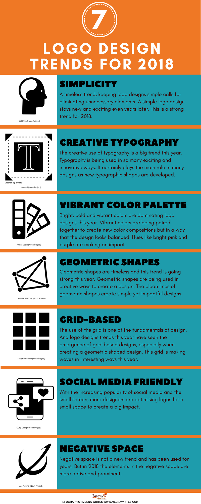
Simplicity seems to be the overriding trend in logo design for 2018. But then it is also a timeless trend which keeps a logo looking new and exciting even years later.
Creative use of typography is another big trend this year with the daring and innovative use of fonts in design - from using sans-serif fonts to new development of typographic shapes and even the simplification of pre-existing fonts in logos. It’s all happening in typography.
Handwritten typography still dominates but it’s not cool to be using downloaded fonts.
Logo designs are embracing vibrant colour palettes with bright pink and purples making an impact on design.
The use of geometric shapes and lines is a trend continuing from 2017 and is a strong contender for logo design this year. Using geometric shapes and clean lines produce clean and elegant designs. Simplicity is extending into geometric shapes too used to produce designs in 2018.
The use of geometric shapes is also seen in grid-based logo designs making a big impact this year.
In 2018, more logos are being adapted for social media so that it fits well in a small space. Some brands create another optimised version for social media or use the optimised version across all branding. Nevertheless, logo designers are now creating innovative designs for social media too.
White space is a vital element in design and in logos is creates a clean, balanced and sophisticated look. While it is not a trend it is a vital aspect of graphic design. But white space used as negative space is a trend that is going strong this year.
Do you have a story to tell about your design business? Need a content writer who understands what it means to be in design? Lets Talk!
PIN ME!


There are no comments yet.